Existing clay render from street
Clay render from the garden
Front, flank and rear extension with loft conversion - West Horsley, Surrey
Brief: Large front, flank and rear extension including a loft conversion
Budget: Undisclosed
Scope: Householder Planning Application & Building Regulations
This project is a milestone for us at Above Studio as it is the largest project we have undertaken to date. The project site benefits from being on a quiet crescent with a backdrop of woodland. The small 2 and half bed 1960’s property sits on a large wedge shaped piece of land surrounded by plots that have been developed.
The clients had a good selection of ideas but required architectural input to form these ideas into a coherant design that would function for family and entertaining. The clients also wanted ‘something a bit different’ to their surrounding neighbours developments that are recently completed and underway which is why they came to us.
What became clear to us after interogating the breif was gaining space was one of the most important factors as was retaining a traditional aesthetic to the street elevation. The clients were happy to be a bit more adventurous to the rear of the property which faces onto the woodland.
We have recently submitted a householder planning application for the project. The neighbours have gained planning and started construction on a similar scale extension so we can be confident of gaining approval. The key difference in the schemes is the move to raise the ridge height of the roof by 300mm to make the loft conversion feasible. The ridge heights on the street vary and the line of the properties steps so we consider this move to be appropriate.
Whilst waiting for the decision we have been conducting studies into various kitchen and bathroom layouts.
The images below show a selection of the design ideas that we tested and presented to the client. The key design ideas that drive each option were to create a sense of genrosity and grandure to the entrance & stair and to create a clear sightline to the garden from the entrance of the property. To minimse unnessesary costs we also looked to retain as much of the existing structure as possible without compromising the design.
Option 01 - The option was driven by retaining the extents of the forward volume of the front elevation. The side addition was then set back from the existing elevation to give a heirarchy to the elevation. This approach would have been quite modern
Option 01_Street Visual
Option 01_Ground Floor Plan
Option 01_Loft Floor Plan
Option 01_First Floor Plan
Option 01_Garden Visual
Option 02 - This option wasn’t constrained by retianing the forward volume of the elevation which allowed more freedom with the layout of the home. With this option the entirity of the existing brickwork would be reclad in a new brick which is more inkeeping with the existing context. In doing so the property will essentially look like a new build and from our experience this looks far better than trying to match new and old bricks.
Option 02_Ground Floor Plan
Option 02_First Floor Plan
Option 02_Second Floor Plan
Option 02_Garden Visual
Option 02_Street Visual
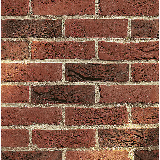
A selection of the tones of bricks that we are considering are shown below. The red tones with handmade/ tubled finish are historically seen in Surrey and will be fitting for the scale and grandure of the property the works will creat.
The design continued to evolve as we moved the design closer to planning. The elevations below highlight two of these changes: the first was that the client prefered a single large window to the street elevation instead of the three small windows. The second was to break up the dormer to make it less imposing. The central volume which houses the stair to the loft floor was recessed to achieve this.
Planning Elevations
The drawing sheet to the right is a study we have done to test the suitability of a second hand kitchen the client had found and wished to buy. The units, worktops and island work perfectly in the space we have designed and the client has subsiquently purchased the kitchen. A second hand kitchen can be a great saving and often you can pick up ex display models which are in near perfect condition.


